Saturday 8 October 2011

Vintage Home

Oh for the house to go with it!


 Ok, so I want chickens!


 Lovely font... Would be ideal as home signage.

 Somewhere in  Russia...

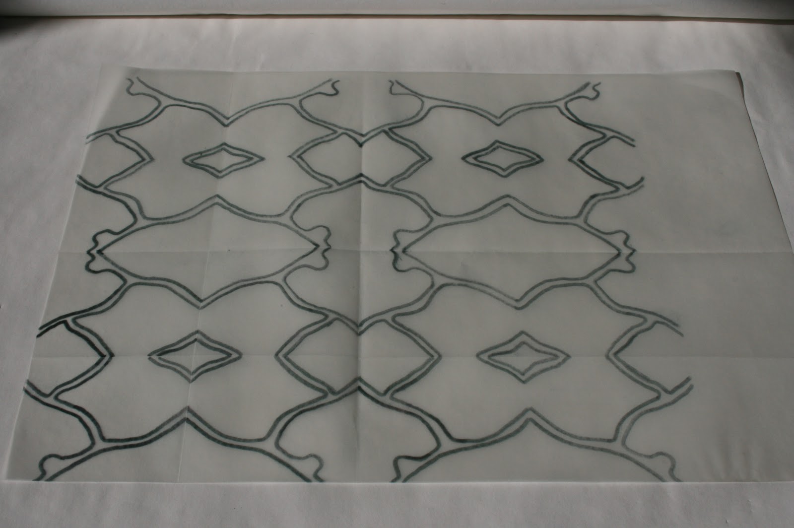
 Great wallpapers by Grow House Grow

 This is EXACTLY how I want my bathroom!

 Icing-sugar pavement  :)
Off track I know but so beautiful!

 And oh for a library to put the books in!


What a great way of updating an old classic
(and much better for it, don't you think?) 


 Graffiti wallpaper with tin-foil you can mark yourself.


 Navaho throw pillow from CaptainCat @ Etsy

 70's drop leaf table by DearOldBlighty @ Etsy


 Enamel-ware kitchen scales from SalvagePatch @ Etsy

Mid-century amber glass cup & saucer from Weald @ Etsy


If you haven't already discovered it, go have a look at Etsy...
www.etsy.com
All handmade stuff from independent makers.
Also a good vintage section, but make sure you select 'Vintage' when entering search terms as 'Handmade' is the default setting. Enjoy!

PARTAKE - London Exhibition - 20th-26th October 2011


Partake is an innovative concept in showcase exhibitions; twenty-four artists from a multitude of disciplines, presenting their work in a collaborative effort to break down boundaries between practitioners, exhibits and the public.

The collective is very participatory so feel free to pop in at any time to get involved or ask questions about the work, there will be artists and designers there all week. There will also be an open 'Project Space' where exhibitors and the public can come together to develop collaborative works and/or develop themes of enquiry.

For more information please contact laura@rara-design.co.uk

The exhibition runs from 20th - 26th October, 2011, at the Old Truman Brewery, 4 Wilkes Street, London, E1, and is open weekdays from 11am - 7.30pm, and the weekend from 12 - 8.30pm.
Free entry.

Monday 3 October 2011

RIPPER PRINTS cont...

The last post showed where I'm going with the wallpaper design. So here're some of my thoughts re. the series of prints...

I've worked with maps a lot in the past and it's one thing I didn't include in the wallpaper, mainly because the maps I had didn't seem to fit with the uterus diagrams I was developing. So I took another quick look at the map...


 Zooming in on the important section.
Picking out details.
Not very interesting as it is.

 I like this though. Could this be the one Annie frequented?
Good lettering on this old map.
This might be something I use later on when developing the prints.

 Like the 3 blocks, but still fairly boring.

Just happened to see some of the sections from the wallpaper and had a thought!
I really like this. It's slightly sinister, no? Like they're seeping out of the buildings or something.

Playing around with different elements in the space.


 Love how here it looks like a shadow cast by the buildings.

 Thought I'd draw it on and see if I got any further...

 Adding another element. The original shadow now emerges from No.29
I didn't like how the 2nd element lay across a lot of the buildings' detail
so it kind of got merged together and I really how that arm looks. 
The rest of it isn't great though.

 Close-up of fallopian tube detail.

 With other text elements behind.

 Unsucessful attempt to develop it further...

Yes, definitely lost my way with it here.

Well, I'm going to have a cigarette and a think and see what I can come up with...

Update RIPPER PRINTS

Proposed outcome: Hand-printed wallpaper and a series of lino prints on related theme.

Ok, (gruesome bit) so we know the Ripper removed her uterus / cervix / fallopian tubes / ovaries and took them away. They were never found. So thought I'd start by working directly from the anatomical diagrams...


Simple Reflect & Repeat

 Not that dissimilar to tiling patterns
Victorian / Medieval / Encaustic etc.

 I think this one's quite sucessful...

 Makes me think of Africa?!

Too far removed from original diagram.
More bone-like.

Going back to original diagram.

Combining elements.

This...
...plus this...
...equals this...
(Murder site = No.29 Hanbury Street)

Sketching / Layering.

One finalised element

...plus...
...equals...
(well ok, not quite but I took the wrong photo)

This fits into the space in the finalised element above.

Won't use this though, doesn't work as well.

And then...
Bit of a jump I know. 
I got pretty carried away but I like the result...

With other element (the finalised one, above)
Balances it out a bit...
But there's still an unresolved section at the top.

 A few options.

Option A.
 Not full enough... and the thick joining bit is quite ugly, n'est pas?

 Option B.
 Better. Is it ok that the elements are repeated 3 times round the top?

 Option C.
 Well, it's not repeating itself round the top but it's not as good visually.
Maybe with a bit of tweaking. 
Have left it for now, though I think I prefer B.

So...
 Adding in the '29'...
 I like it, maybe because it adds a different aspect?

 It's a fairly pretty pattern, given the subject matter.
Maybe if I print the 29 in a really blood red?


Now, I haven't really given a thought to colourways yet...